AI tools can generate images. They still can't understand what a designer actually needs.
Cue is a context-aware AI intent layer that translates designer thinking into precise AI output, without leaving your design tool or learning prompt engineering.

ROLE
Product Designer
TYPE
Self-Initiated Concept
TIMELINE
4 Weeks
PLATFORM
Desktop / Design Tool Panel
THE MOMENT IT BREAKS
I needed a background image. What followed was 30 minutes across three applications.
I was designing a social media post for a luxury hotel brand called Maison. Simple brief. I needed a atmospheric background image, warm, minimal, editorial, that would sit behind large gold typography. I opened the AI generation tool. It showed me a blank prompt field and waited.
I typed what felt natural: "luxury hotel lobby warm background." Six words. I hit generate.
What came back was generic. Stock photography energy. Warm orange lens flare, ornate chandeliers, nothing close to the modern minimal aesthetic the brand needed. So I did what most designers do when a tool doesn't understand them. I left. I opened ChatGPT in another tab, described my need in plain English, asked it to write me a proper prompt, copied the result, went back to the generation tool, pasted it in, generated again.
The results were better. But the tool had hallucinated text into the images, garbled letterforms baked into the architecture. I couldn't use them. I downloaded the least broken one anyway, went back to Illustrator, placed it behind my text.
It looked wrong. Thirty minutes gone. I was back where I started.
THE BROKEN WORKFLOW
Six steps. Three applications. One design task that should have taken two minutes.
These are real screenshots from an actual design session. Nothing is recreated or staged.
STEP 01
Adobe Illustrator workspace. The artboard has the MAISON brand name in gold. The background is empty. I need an AI-generated image to fill it.

STEP 02
I open Adobe Firefly. A blank prompt field. I type what feels natural, six words. This is where most designers are already stuck.

STEP 03
The results. Generic warm hotel lobbies. Orange lens flare. Ornate chandeliers. Nothing close to the modern minimal luxury aesthetic the brand needs. The tool gave me what the words said, not what I meant.

STEP 04
I leave the design tool entirely. I open ChatGPT and describe my need in plain English. ChatGPT generates a 200 word structured prompt. This is what the AI generation tool actually needed to understand me.

STEP 05
Back in Firefly with the structured prompt. The results are dramatically better. Cool marble, minimal architecture, editorial lighting. But the tool has hallucinated text into every image. Garbled letterforms baked into the walls. Unusable.

STEP 06
Back in Illustrator. The best available image placed behind the MAISON text. The composition doesn't work. The colors clash. The hallucinated architecture competes with the typography. Thirty minutes later, I'm back where I started.

“The problem wasn’t the AI’s capability. The results at Step 05 proved the technology works. The problem was that communicating designer intent to an AI tool requires a completely separate skill set that has nothing to do with design ability.”
INDUSTRY PATTERN
Every AI generation tool has the same problem. I checked.
Before designing anything I wanted to understand whether this was a single tool’s failure or an industry-wide pattern. I opened every major AI generation tool available and looked at one specific thing: what does the tool show you when you need to create an image?
The answer, across every tool I tested, was identical. A blank text field. Waiting.

ADOBE FIREFLY
Blank prompt field. No context. No guidance. No knowledge of what you're designing. The entire interaction model assumes you already know how to communicate with an AI. "Describe what you want to generate" but how?

CANVA AI
Friendlier tone but fundamentally identical. A blank field waiting for a prompt. Has Style and Aspect Ratio dropdowns, technical parameters, but still assumes you can describe your creative need in text. No knowledge of any existing design context.

DALL-E / CHATGPT
The most conversational framing. Has generic idea shortcuts like Studio headshot and Blueprint poster, the closest any tool gets to guided generation. But these are generic categories completely disconnected from your specific design task. Still starts blind.

MICROSOFT DESIGNER
The most honest about what it's asking. A massive empty text area. The example prompt shown is about a flamingo with surreal features. That tells you exactly who this tool thinks its user is. Not a professional designer working on a luxury brand campaign.
Four tools. Four companies. Four different headlines asking the same question. None of them know anything about what you’re designing.
THE REAL PROBLEM
Prompt engineering is not a design skill. It never should have been.
Every major AI generation tool today puts a blank text field in front of the designer and waits. The assumption baked into that interaction model is that the designer knows how to write a structured, detailed, technically precise prompt that will reliably produce what they have in their head.
That assumption is wrong. And it affects every designer equally regardless of experience level. A designer with 20 years of professional experience and a designer in their first year face exactly the same barrier in front of a blank prompt field. Because neither was trained in prompt engineering. They were trained to design. Prompt quality has no correlation with design skill, creative vision, or professional experience. It is a completely separate discipline with its own learning curve.
There is a second problem layered underneath. AI generation tools are blind to context. They don’t know what you’re designing, what’s already on your artboard, what colors you’re working with, what mood you’re trying to achieve, or that you need clean negative space in the center because you’re overlaying typography. Every generation starts from zero. The designer has to re-communicate all of this context every single time.
01
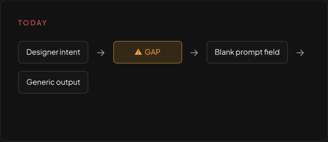
THE INTENT GAP
Designers can't communicate what they want
A blank prompt field requires prompt engineering knowledge. Designers think in visuals, mood, composition, and brand language. The gap between designer intent and AI input has no bridge.
02
THE CONTEXT GAP
AI tools don't know what you're designing
Every generation starts blind. The tool doesn't know what's on your artboard, what brand you're working with, what colors you're using, or that you need empty space for typography. Context has to be manually re-communicated every single time.
HOW DESIGNERS ACTUALLY THINK
The real decision flow when a designer needs an AI-generated asset.
Before designing any solution I mapped the actual mental process a designer goes through when they need an AI-generated asset. Not the ideal flow. The real one. What actually happens in practice.
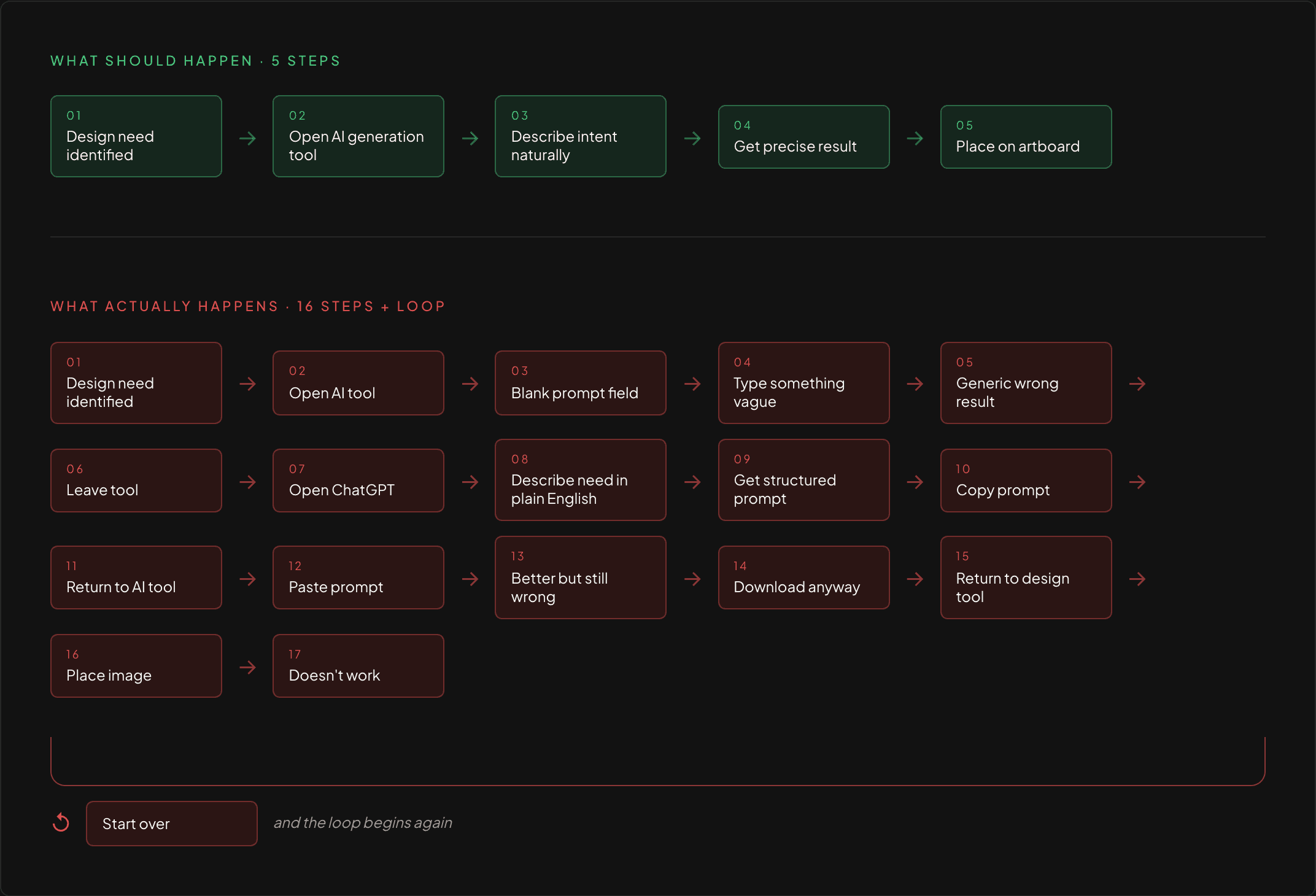
Sixteen steps to accomplish what should take five. The extra eleven steps exist entirely because the tool doesn’t understand designer intent.
WHY CURRENT WORKAROUNDS FAIL
Designers have found ways around the problem. None of them actually solve it.
WORKAROUND 01
Use ChatGPT to generate prompts
PRO
Produces better structured prompts
CON
Requires leaving the design tool entirely. Breaks creative flow. Adds 20 to 30 minutes per task. Still requires the designer to accurately describe their need in text first.
WORKAROUND 02
Trial and error with short prompts
PRO
Fast to start
CON
Produces generic, unpredictable results. Designers iterate blindly with no understanding of why results are wrong or how to improve them.
WORKAROUND 03
Give up and use stock photography
PRO
Reliable and familiar
CON
Completely abandons the creative potential of AI generation. The tool exists but is not used. The barrier to entry was simply too high.
All three workarounds share the same root cause. The design tool doesn’t understand designer intent and nothing bridges that gap.
THE INSIGHT
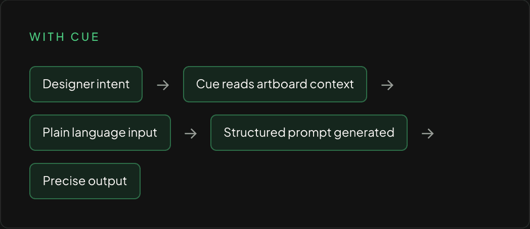
The tool doesn’t need better prompts. It needs better context.
Cue is a side panel that lives natively inside your design tool. It reads what’s on your artboard, accepts a plain language description of what you need, and handles everything between your intent and the AI output, invisibly, without requiring prompt engineering knowledge.
PROJECTED IMPACT
What changes when the tool understands the designer.
Cue is a concept project. These projections are based on documented personal workflow experience and are not from a live product.
2 min
Average time per AI generation task with Cue
vs 30 minutes of context switching across three applications today, documented during an actual design session.
0
Prompt engineering knowledge required
Designers describe their need in plain language. Cue handles the translation invisibly.
100%
Of the workflow stays inside one tool
No ChatGPT tab. No separate generation window. No downloading and re-importing.
CREATIVE IMPACT
When tool friction disappears, creative experimentation increases. Designers who currently avoid AI generation because the barrier is too high will explore it naturally when the tool speaks their language.
TEAM IMPACT
Prompt engineering has no correlation with design skill or experience. Cue levels the playing field. Output quality is determined by creative vision, not technical knowledge of AI systems.
LOOKING BACK
What this project taught me about designing for AI.
The most important realization from this project was that the AI capability was never the problem. The Step 05 screenshots proved that. When given the right input, the generation tool produced genuinely impressive, usable results. The failure was entirely in the interface between human intent and machine input.
That reframing changed everything about how I approached the solution. I stopped asking how to make designers better at prompting. I started asking how to make the tool better at understanding designers. Those are very different design problems with very different solutions.
If I were taking Cue further, the next horizon would be learning from designer behavior over time. Which generations do they place on the artboard. Which do they discard. Which plain language descriptions produce the results they actually use. That behavioral data would let Cue become genuinely personalized to each designer’s visual language rather than starting from a generic understanding every session.
The second thing I would explore is collaborative context. Right now Cue reads a single designer’s artboard. But most professional design work is collaborative. A brand system shared across a team represents enormous shared context that every designer on that team could benefit from. Consistent style references, approved color systems, established mood direction. Cue could read that shared context and make every generation request across the team smarter.