GlobeX: Bridging the "Confidence Gap" for Global Travelers
Turning unfamiliar exchange rates into clear, confident decisions.
Driving Conversion Through Cognitive Comfort

CONTEXT
Consumer FinTech / Currency Exchange Product
ROLE
Product Designer
Tools
Figma
TIMELINE
6 weeks
The Outcome
Safeguarding the Funnel
I optimized GlobeX’s core transaction flow to neutralize the 'decision paralysis' that frequently leads to mobile abandonment. By strategically managing the user’s cognitive load, this redesign protects the conversion funnel from the drops in performance typically caused by information overload.
INTRODUCTION
The "Math at the Counter" Moment
Traveling to a new country often comes with small moments of uncertainty. Imagine standing at a busy street food stall in a foreign city: you're hungry, the line is moving fast, and you’re staring at a price tag in a currency you don't recognize. You find yourself doing frantic mental math, wondering if you’re about to pay $5 or $50 for a snack.
This isn't just about numbers; it's about a spike in cognitive workload that leads to "choice fatigue", where the effort of making a simple decision becomes so draining that we either overspend or give up entirely. I designed GlobeX to close this gap, transforming currency exchange from a moment of stress into one of clarity.

THE PROBLEM
When Mental Exhaustion Leads to Abandonment
The core challenge for GlobeX is that the traditional "catalog-first" approach on mobile creates a direct conflict between complex financial data and the limited mental bandwidth of a traveler.
DEFINING THE STAKES
Meeting Calvin and Rashid
Calvin Liu
The Experience Seeker
The Struggle
Calvin often falls into the "accuracy vs. effort" tradeoff. When an app is too complex, he settles for a "good enough" rate just to end the mental exhaustion, even if it means losing money
The Need
He needs a solution that respects his limited processing capacity while on the go. He wants a tool that acts like a helpful assistant, allowing him to stay present in the moment rather than stuck in a calculator.
Rashid Ali
The Precision Planner
The Struggle
Between back-to-back meetings, he faces a high cognitive workload when forced to compare inconsistent rates across multiple apps.
The Need
He requires "instant clarity" and full transparency. For Rashid, hidden fees aren't just an annoyance; they create a lack of trust that leads to hesitation and decision-making anxiety
Mapping the Friction
Two Paths to Confidence
I mapped the journeys of Calvin and Rashid to identify where information overload on mobile devices turns a simple currency exchange into a source of stress.
Calvin’s journey is a constant battle between accuracy and effort. While filming on the go, he needs a frictionless flow that respects his limited processing capacity, allowing him to spend his mental energy on his content rather than mental math.
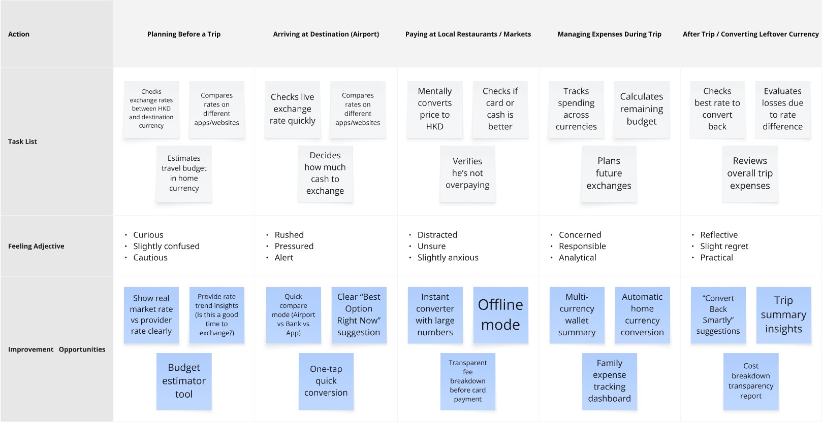
For Rashid, the journey is defined by a high-stakes need for transparency. Managing a family budget while traveling for work creates a significant cognitive workload; he requires a tool that eliminates "decision anxiety" through immediate, upfront fee clarity.

RESEARCH & USABILITY TESTING
The "Aha!" Moment
I conducted two rounds of usability testing to see how real people navigated the flow. My goal was to see if users could check rates and review fees without second-guessing themselves.
The feedback was clear:
"You have / You need" was an immediate hit; it simplified the mental model.
Transparency builds trust: When users saw the fees upfront, their hesitation vanished.
Synthesis: My research synthesis (using clustered insights) showed that transparency wasn't just a "feature", it was the product's primary value proposition.
Understanding the Exchange Landscape
Identifying gaps in existing currency exchange products to uncover opportunities for a more confidence-driven travel experience.
To understand how existing products support (or fail) international travelers, I analyzed four widely used currency exchange platforms: Wise, XE Currency, Revolut, and Travelex.
Rather than comparing features in isolation, I focused on how these tools feel in real travel contexts, moments when users are anxious about rates, fees, and decision-making in unfamiliar environments.
I mapped recurring strengths, weaknesses, and gaps across competitors and synthesized them into a SWOT-style framework to highlight where GlobeX could meaningfully differentiate.

INSIGHTS & PRIORITISATION
Focusing on P0
I didn't try to solve everything at once. I prioritized "Priority 0" insights, the ones that directly affected a user's confidence. If a feature didn't help a user feel more secure in their decision-making accuracy, it was moved to a later phase.
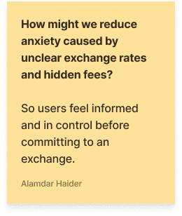
HOW MIGHT WE
Framing Our Design Challenges
Transforming user friction into actionable goals for the GlobeX experience.


IDEATION & WIREFRAMES
Finding the Right Balance
In the early exploration phase, I sketched multiple layout directions. I was looking for the simplest way to present complex financial data without overwhelming the user’s limited processing capacity. I eventually combined the strongest elements, the most intuitive inputs and the clearest rate displays, into a focused low-fidelity wireframe that served as the blueprint for the final design.

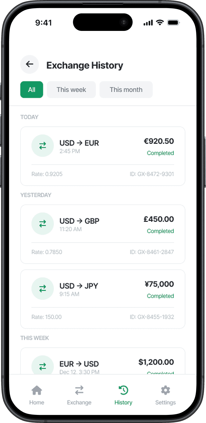
HIGH-FIDELITY DESIGNS
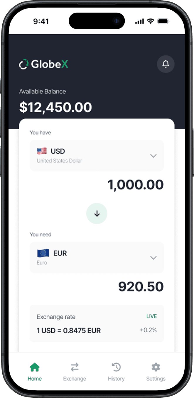
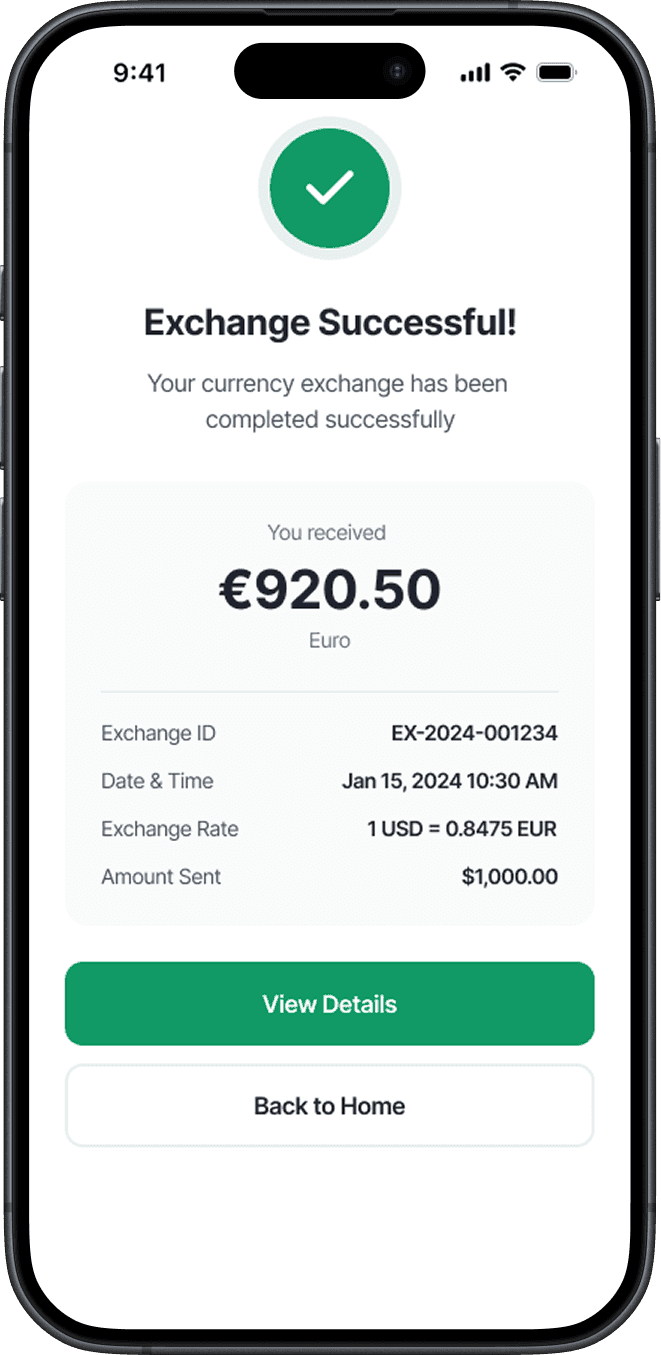
Clarity by Constraint
The final high-fidelity designs use restrained color and a clear hierarchy to support fast, accurate decisions.


THE PROTOTYPE
Demonstrating a seamless, low-friction exchange experience in motion.
This walkthrough highlights how the interface actively reduces cognitive workload by providing a clear, step-by-step path from currency selection to final confirmation.
You can see how the design mitigates choice fatigue; the transition between screens is intended to feel like an "assisted" experience that respects the user’s limited processing capacity while they are on the move. This captures the fee breakdown's transparency, reinforcing the trust needed to bridge the "confidence gap" in high-stakes financial decisions.
Visual System & Components
I established a modular framework to minimize cognitive load and ensure interface predictability

REFLECTION
Design as Reassurance
Early on, I explored consolidating verification data into a single unified view. After reviewing this direction with stakeholders and considering audit requirements, it became clear that this approach conflicted with system ownership and compliance constraints.
Incremental improvements proved more viable.