Leafy
A calm way to understand what your plants are telling you
Designed for clarity, confidence, and the elimination of plant-care anxiety.
CONTEXT
Consumer Technology / Home & Lifestyle
ROLE
Visual Designer / UX Designer
SCOPE
Mobile & Desktop Experience / Brand Identity / Scalable UI System
TIMELINE
8 weeks
OVERVIEW
Why this project mattered.
Leafy is a product that helps users diagnose plant health issues and take the right next steps without feeling overwhelmed.
THE PROBLEM
People care about their plants, but they don’t trust their decisions.
When a plant starts looking unhealthy, users search for answers and quickly get overwhelmed. Advice is conflicting, diagnoses feel absolute, and uncertainty leads to hesitation.
The result is predictable.
Confusion turns into anxiety. Anxiety turns into inaction.
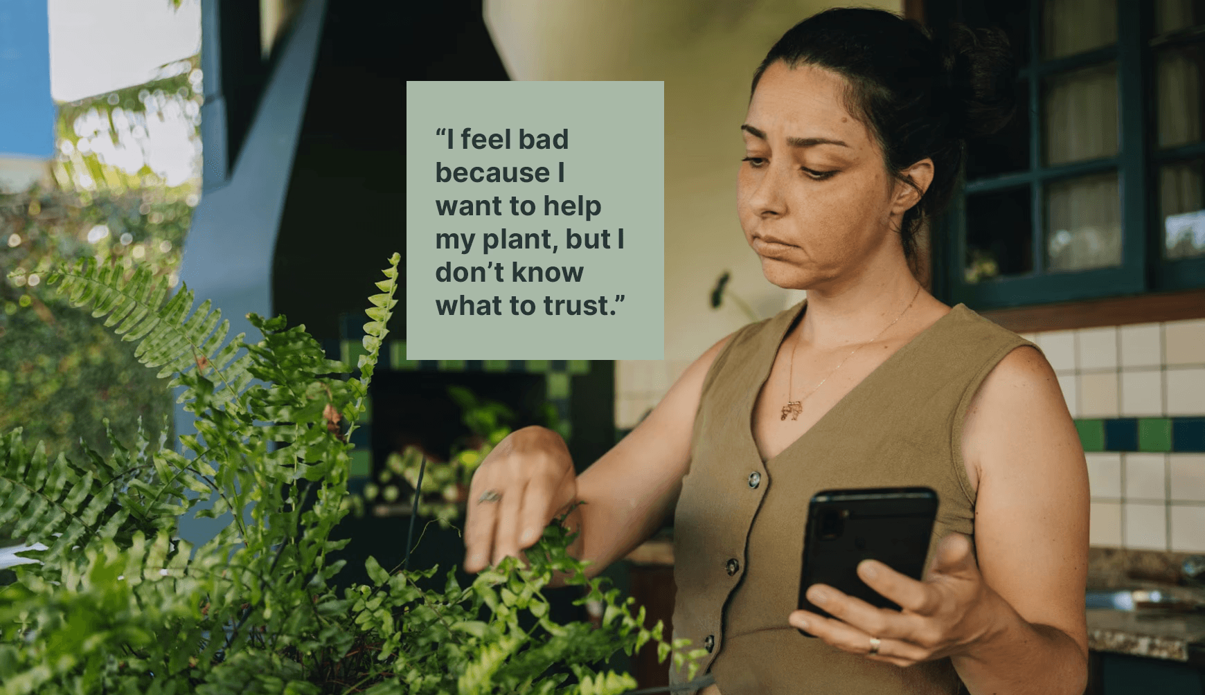
For the business
This means abandoned flows and low long-term engagement.
For users
It means stress and stalled care.
THE SOLUTION
Replacing guesswork with calm, guided clarity.
Leafy reframes plant diagnosis as a supportive process rather than a moment of judgment.
Users are guided through observation, shown honest confidence levels, and given clear next steps.
The experience feels steady and reliable, helping users move from uncertainty to action.
UNDERSTANDING THE LANDSCAPE
Existing products showed us what users experience today and what’s missing.
I looked at PictureThis, Planta, PlantSnap, and the informal competitors: Google, Reddit, and YouTube. Each has strengths. PictureThis does fast identification well. Planta has solid scheduling. PlantSnap leverages camera input effectively.
What They Do Well
Where They Fall Short
Diagnoses often feel too confident, even when outcomes are uncertain
Advice is generic or disconnected from the actual symptoms
Too much information is shown at once, creating overwhelm
Visual tone swings between clinical and playful, rarely calm
Very few products explain why a diagnosis was reached
Recurring Patterns
Binary answers to complex problems
Information first, decisions later
Confidence without transparency
Little consideration for user anxiety
Soft sage green establishes calm and trust.
Warm terracotta replaces harsh reds for warnings.
Warm white backgrounds reduce visual fatigue.
Neutral grays keep content grounded and readable.
Every color choice answered one question.
Does this reduce anxiety or increase it?
If it increased tension, it was removed.
DESIGN PRINCIPLES
These principles acted as guardrails for every decision that followed.
I mapped the journeys of Calvin and Rashid to identify where information overload on mobile devices turns a simple currency exchange into a source of stress.
Clarity over cleverness
If something needed explaining, it was too complex.
Progressive disclosure
One decision at a time. No jumping ahead.
Trust through restraint
No dramatic colors. No absolute claims. No noise.
One system, many surfaces
Mobile and desktop should feel like the same product, not siblings.
BRAND EXPLORATION
Defining how Leafy should feel.
I started with rough, hand-drawn explorations to understand the personality range.
Soft versus structured.
Organic versus geometric.
Friendly versus credible.
The goal was not to be cute.
It was to feel approachable without losing seriousness.
These sketches helped narrow the direction before committing to anything polished.

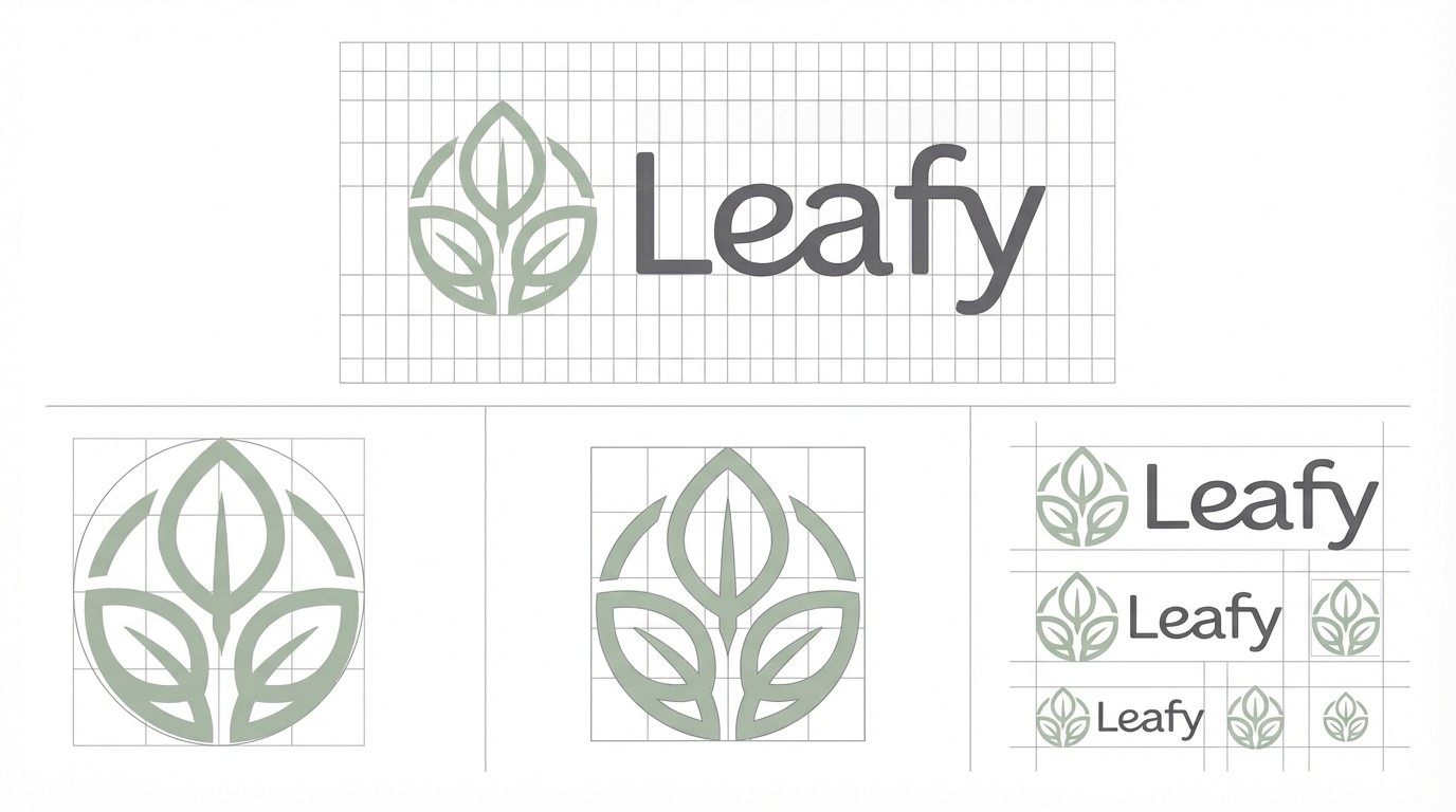
FINAL LOGO SYSTEM
A logo designed to behave like a product component, not a decorative asset.
The final Leafy logo is built on a clear geometric grid with consistent curves and controlled negative space. This was intentional.
Leafy lives inside interfaces. The logo needed to scale cleanly, remain balanced at small sizes, and sit comfortably inside headers, cards, and navigation.
This construction system ensures predictable behavior across mobile, web, and dense UI contexts.
COLOR SYSTEM
Color was used to regulate emotion
Soft sage green establishes calm and trust.
Warm terracotta replaces harsh reds for warnings.
Warm white backgrounds reduce visual fatigue.
Neutral grays keep content grounded and readable.
Every color choice answered one question.
Does this reduce anxiety or increase it?
If it increased tension, it was removed.

TYPOGRAPHY
Type needed to disappear so the content could do its job.
Inter was chosen for its clarity, neutrality, and consistency across platforms.
Hierarchy is strict and predictable.
Headlines guide attention.
Body text explains without overwhelming.
Metadata supports without competing.
Typography in Leafy is not expressive.
It is dependable, and that dependability builds trust.

EXPERIENCE FLOW
The entire product is structured as a calm conversation, not a form.
The journey follows a simple rhythm.

Nothing jumps ahead. Nothing feels rushed.
This structure reduces decision fatigue and keeps users oriented throughout the flow.
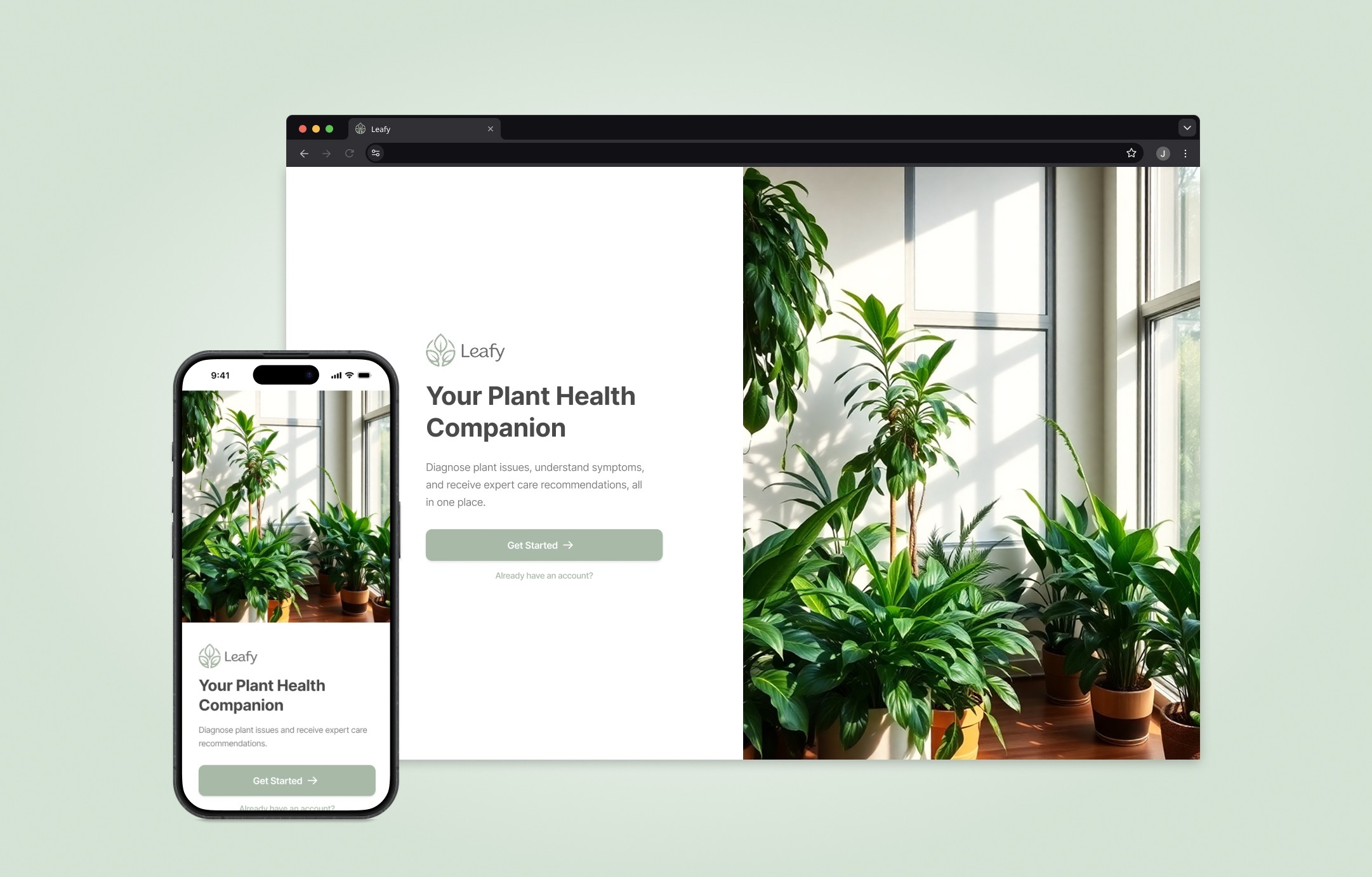
MOBILE EXPERIENCE
Focusing on the moments where design decisions mattered most
The final high-fidelity designs use restrained color and a clear hierarchy to support fast, accurate decisions.
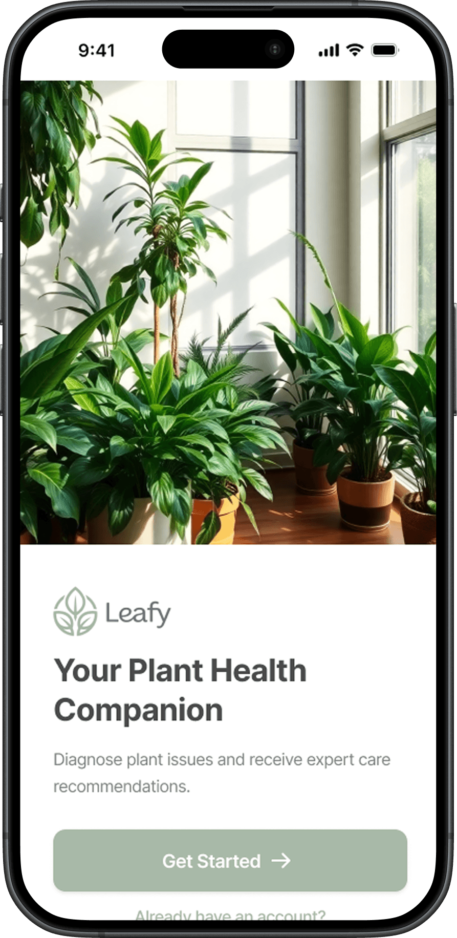
Welcome and Onboarding
Answering the most important question immediately. Am I in the right place?
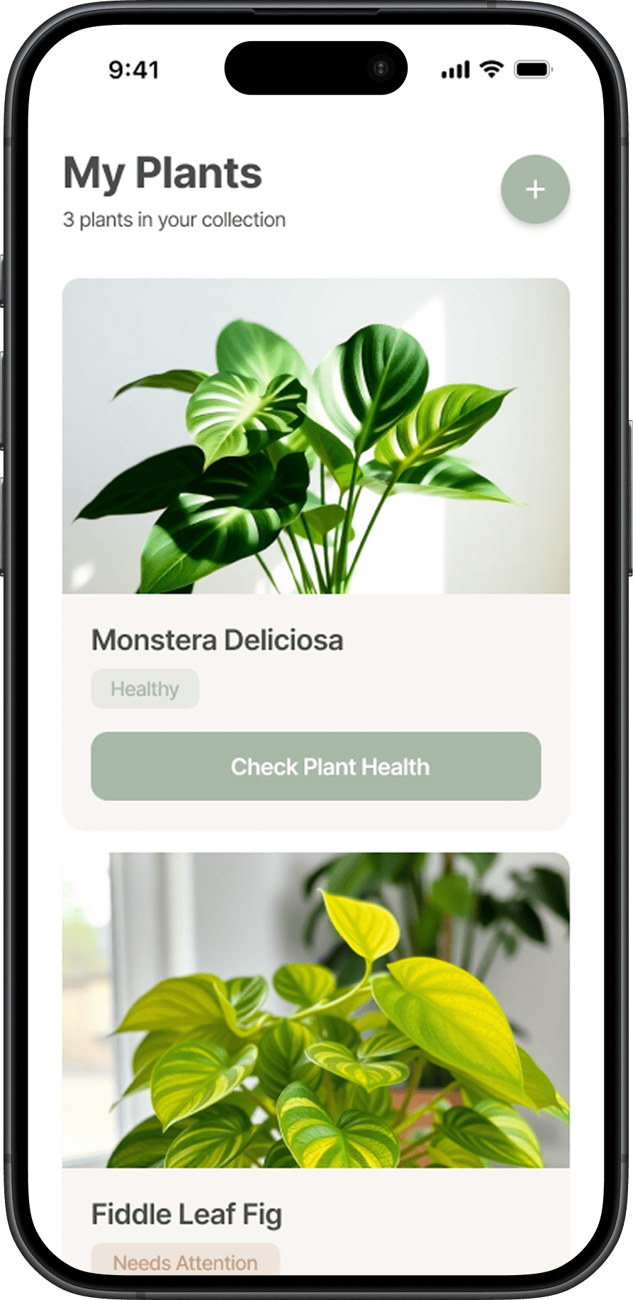
My Plants
Status at a glance, without panic.
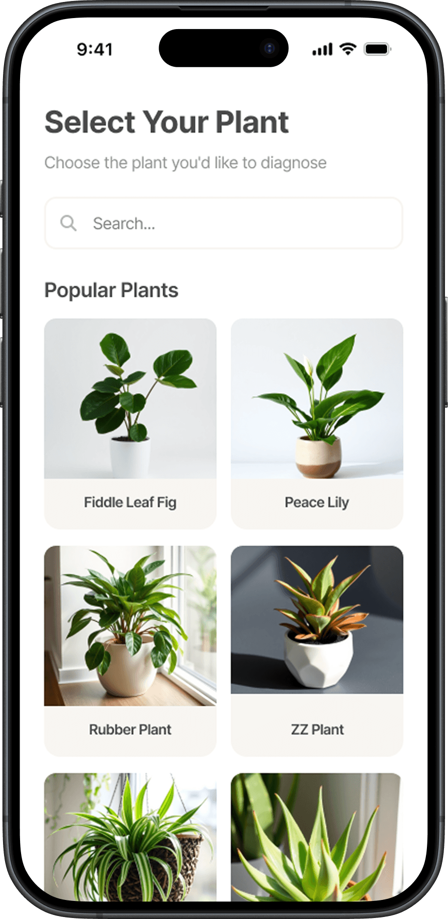
Plant Selection
Recognition is easier than recall.

Symptom Selection
This is where anxiety usually peaks, so everything slows down.

System Transition State
Sometimes the best thing a product can do is stay quiet.
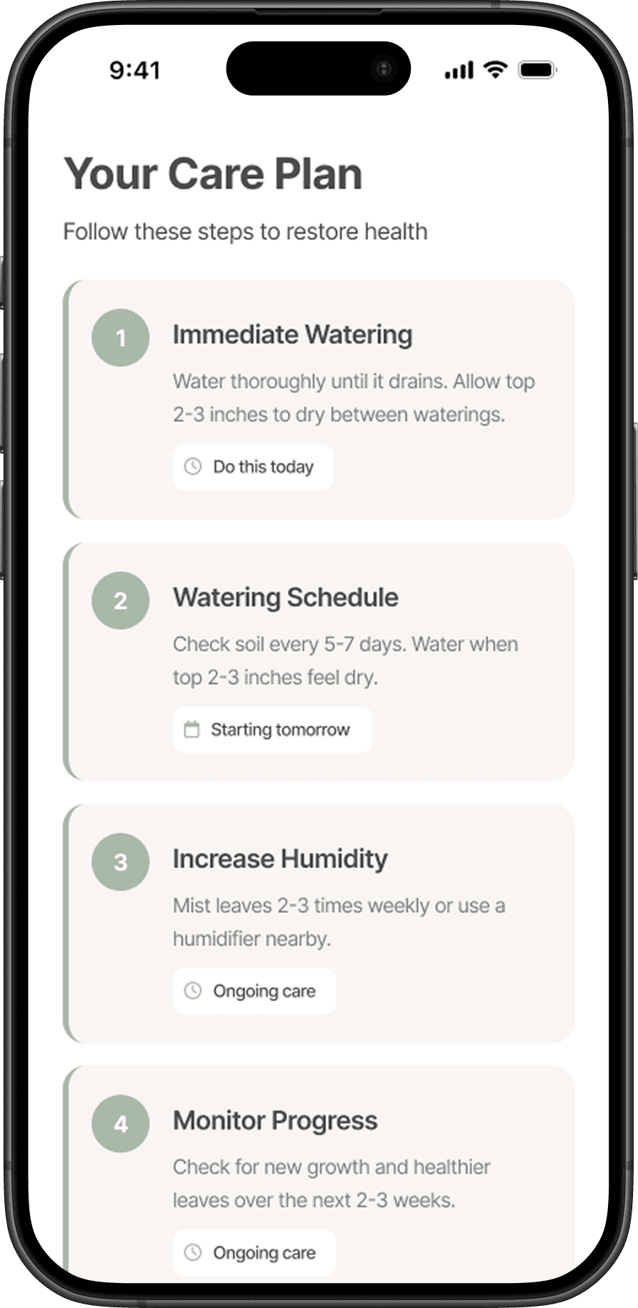
Diagnosis Result
Honest insight instead of false certainty.
DESKTOP EXPERIENCE
Flow matters more than static perfection.
ACCESSIBILITY AND QUALITY BAR
Accessibility treated as a baseline expectation.
Color contrast meets WCAG standards.
Tap targets are generous.
Focus states are clear.
No information relies on color alone.
OUTCOME
A product people feel comfortable returning to.
Users finish the flow feeling calmer and more confident than when they started. They understand what’s likely happening and what to do next.
That confidence drives better completion, repeat use, and long-term trust.
The same system supports growth across platforms without redesigning the core experience.
Leafy doesn’t aim to impress in one moment.
It earns trust over time.
REFLECTIONS
Good design often comes from removing the right things.
This project reinforced the value of restraint, pacing, and honesty.
By designing for clarity and trust, Leafy supports both user confidence and sustainable product growth.
Sometimes the most effective design decision is simply to slow down and guide.